

HelloSign is a Dropbox company that provides a Web-based eSignature solution: If you have a document you want someone to sign, you upload the document file, then show you an editor in which you place all the fields to build the form the recipient will fill out—signatures, dates, initials, etc. You send this prepared form to the recipient. When they’re done signing, everything is reassembled into a PDF with signatures that serves as the legally-binding document.
It’s trickier than it might seem to maintain pixel-perfect layouts for a wide range of document types and annotation fields across an ever-expanding range of screens. The three modes in which a document is presented—the Editor, the Signer app, and the final overlay as a single, immutable record for posterity—must each display their contents onscreen in pixel-perfect layout at each step, regardless of who’s looking at them on what. Otherwise, users at both ends may not trust the system as much as they would handwritten ink on paper.
Defining the project
The problem
Browsers can’t display all the file types we support for signing. To make HelloSign work in any browser, we convert the document file that you upload to a set of images. In both the Editor and Signer steps of the process, we show you images of your document’s pages and draw the signing fields on top of them. This overlay process draws the fields over a transparent background (instead of the page image itself), which we merge with the original file to present onscreen. All three components—the Editor, Signer, and completed document—must display accurately regardless of the user’s screen resolution. So at a minimum all fields need an address, width, height, type, and unique identifier.
In October 2018 I was in a meeting where we were asked to bring ideas to:
- Improve fidelity between the Editor, Signer page, and final signed document
- Increase the speed at which components can be placed and changed in the Editor
- Increase the Editor's usability as a whole
We needed to improve fidelity because we had some bugs where the Editor experience didn’t always look the same as the Signer experience, and it wasn’t always the same as the final PDF. Sometimes you would place a checkbox perfectly in the Editor, yet it would be misaligned when displayed in the Signer. But then it might look fine on the final PDF. You can imagine how this could erode a customer’s trust. We’re producing legally binding documents, so everything has to be exactly right and unambiguous at each step.
The proposed solution
From my perspective, the root problem was obvious: we had 3 different implementations of a document viewer:
- Editor: one 12,000 line jQuery file
- Signer: React app
- Overlay: PHP scripts that build the final PDF using Cairo
We discussed whether we should be bug-fixing the Editor to make it match the Signer, or the other way around. I argued that the best way to keep three viewers in sync was to just make them all the same viewer. I pushed hard for rewriting the Editor first, with the plan of using the same code to power the Signer and Overlay. One of the arguments against it was that there was a recent failed project to rewrite a different jQuery-based page that wasn’t as complex as the existing Editor.
I asked for time to go build a proof of concept for a rewrite in React. I knew I could do it, because I used to work at Courseload/Unizin where we had a web-based ebook reader for classrooms. It worked by converting everything to PNGs, then drawing comments and annotations over the images. It had the additional complexity that users needed to be able to select text that wasn’t really there. It used to be a jQuery app, but I lead the development effort to replace it, first as a Backbone app and then converted in-place to React, which has an easier mental model to think about. Instead of having to think about how to change the DOM (Document Object Model), each component specifies its HTML and React makes the changes.
Choosing what to change when
Whether considering a rewrite or refactor project, I think it’s natural to ask “should we redesign the UI, too?” We chose not to, for several reasons. First, we were ready to start engineering work, but to redesign the UI we would have needed more time for research, writing specs, user testing, and creating designs. Second, there was low-hanging fruit in terms of features, usability, and fidelity that could be quickly retrofitted into the original design without the process of a redesign. By keeping the user-facing changes small, we’d be able to get these improvements into the hands of customers faster. They wouldn’t have to choose to jump to a whole new UI to get features like keyboard shortcuts.
How we built it
Build in layers
The Editor has 4 main parts to be separated:
- Transport (Communication with the backend)
- <EditorPage
- <EditorContext
- UI
For communication with the backend we have one object that holds functions to represent every call to the backend we need. Instead of putting fetch('/editor/saveData', …) in components, we have an object with a saveData(data) function. Components don’t have to know things like URLs, GET vs POST, CSRF token, etc. They just call a function and get a promise. All of that setup means that in tests we can provide a mocked backend. It’s much easier to jest.spyOn(backend, 'saveData') than to have to match against calls to fetch that POST to /editor/saveData.
Our Jest tests can boot the whole Editor with a mock backend, so it makes for a fairly realistic test. The only thing I can think of that didn’t work in JSDOM was a few places that used element.getBoundingClientRect(). JSDOM doesn’t compute layouts, so it returns zero for all values. The previous Editor didn’t have Jest tests—it relied on the QA team’s Selenium and manual testing. It’s great to have those tests, but they live in a different repository and are run nightly. With this mock backend the Jest tests don’t need to run a web server, so they can run on every pull request or as part of a commit hook. That lets us catch bugs earlier.
Make UI a functional representation of state
Before I started using React in 2015 I read a blog post about Om (A ClojureScript UI framework and client/server architecture over Facebook's React). In it the author said “UI is a functional representation of state.” That phrase resonated deeply with me.
At the time I was building Backbone apps. They would use a template for the initial render, but updates were generally done by manipulating the DOM manually. This meant that the template needed to be able to render any state the data might be in, but also meant the manual DOM updates needed to be able to change from any state to any other. I’d much rather use React’s model, in which we just re-render a Virtual DOM and let React go apply the updates.
If the whole Editor is a “functional representation of state”, then the state and its manipulation need to be as isolated from the UI as I can get it. So near the top of the component tree we have a component named <EditorContext that doesn’t produce any DOM. Its jobs are to hold Editor state, change state, and to publish data/functions through React.Context. The important part isn’t the React.Context, it’s that there is a place that changes the state without being connected to a UI.
<Editor also very specifically does NOT have any code for contacting the server. It just has an onSave prop that it calls without knowing how the save is implemented. I think of it a bit like an ultra-fancy <input. An <input accepts a value and an onChange, but something above it has to respond to events and update the value. For us, we have <EditorPage which uses the transport layer to talk to the server and renders an <Editor with its value and event callbacks. To <EditorPage, <Editor is a black box.
Speed up testing to speed development
Storybook is one of the best tools I had for this project. It seems most people use it for building libraries of small reusable components. There’s no size or complexity limit on the components that can go into Storybook. But what helped most is that you don’t have a backend/API to talk to.
I needed to prove I could build a new Editor UI as quickly as possible, so I didn’t want to mess around with making everything run in the app. In our app, the editor is loaded in an <iframe inside a modal. Were I to build in the app, I’d have to go trough the process of uploading a file, filling in some signers, launching the Editor, and then every change would require me to start over. Using Storybook also helped us get early feedback on the UI. We published it internally so that Product, QA, and Design could all try it out.
To build in Storybook I needed to setup a signature request for it to load. Storybook has a hot reload feature where after every change, it can swap the whole component tree without having to refresh the page. This means I was able to use that onSave to store the Editor’s data (with @sambego/storybook-state) so that a hot reload regenerates the whole Editor but doesn’t lose whatever changes I made. At any time I can do a full refresh to reset everything.
Because we weren’t redesigning the UI, I needed to achieve the same output using React. To build the toolbar I ran the old Editor and copied the HTML (using dev tools) into a new component. From there I could use a screenshot of the old toolbar to make sure I wasn’t breaking the styles as I pulled chunks of HTML into new components.
Here’s a Slack message I posted two weeks after starting the project:
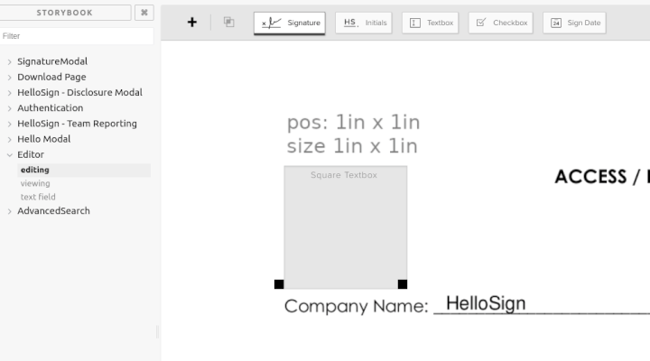
I have the major components of what a React editor/view might look like. In this demo I edited the PNG to place a 1 inch square 1 inch into the document to verify positioning and have placed a textbox exactly over it. I have a Handle component that manages the size and positioning of any field type. Then I have a very basic implementation of a textbox. I don't expect to keep this, but to demonstrate the flexibility of this approach, if I press shift while editing it draws a 10x10 grid and snaps the controls to it. In viewing mode the Handle component is still there to position the field that way we get perfect fidelity between the two. On the text field page, it just renders all the variations of a component. If there is going to be drift between editing and signing it will show up there and will be very obvious.
Consolidate state management
HelloSign was built as a PHP app, with the server rendering each page and adding custom JS for client-side interaction. React was part of the stack before I joined, but it was often used from PHP. We have a custom PHP function render_react_component() that returns a placeholder div and generates a ReactDOM.render(...) which renders the component into the placeholder. This was a fine transitional strategy for introducing React, but it meant that component properties could only be set once as PHP generated the page.
The biggest chunk of React in our codebase was the Signer app. It didn’t use render_react_component(), but it did use models similar to what I used to use in Backbone. I didn’t want to continue that pattern, because it doesn’t follow React's one-way data flow. So the Editor was one of the first things I put into src/hellospa (Hello Single Page App). HelloSPA uses React Router to do its own routing with code splitting, so ideally all that PHP has to do is render an empty page and load hellospa.js. We’re moving toward a point where everything the user sees and interacts with comes from our frontend codebase, instead of it being split across PHP in one repository and React in another.
We didn’t have a standard state management library, so at the time I wanted to try regular component state and React.Context. One of the top level components in the Editor holds everything in local state and then publishes it through React.Context. While this strategy worked, I would recommend something like Redux over building your own Context-based state management. React.Context compares its value by reference to see if it changed. So if you’re building a new value object on every render, it will cause everything using the context to re-render. I worked around that by building what I called contextCacher. It does a shallow-compare of the object and if everything matches, it returns what’s in the cache instead of the new object passed in. It works similarly to the useMemo hook, but instead of passing dependencies and running a function you just pass an object.
const contextValue = this.contextCacher({ fields, pages })
// The code above works the same as this hook.
// const contextValue = React.useMemo(() => ({ fields, pages }), [fields, pages])

return <Provider value={contextValue}>{this.props.children}</Provider>
An aside on wrangling coordinates
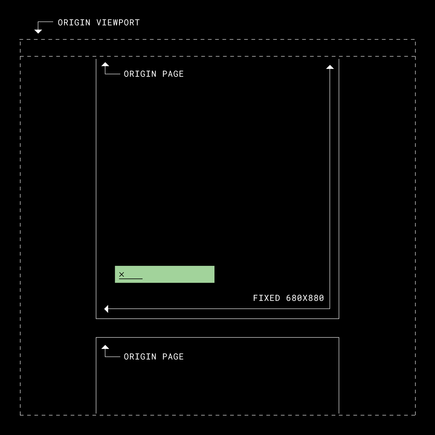
Having done this before, I knew one of the challenges to placing information onscreen reliably would be transforming addresses between different coordinates. It’s not that the math is hard, but that it can be hard to keep track of working across two different coordinate spaces. No matter the physical size on your screen, we address a US Letter Portrait page as being 680x880 units. If we have a field at (340, 0) (top-center), but you’re on a screen where the page is physically 1020px wide, where is that field? (510,0) I really wanted to solve this problem with an SVG because they can define their own coordinate space. I’ll just use <svg viewBox="0 0 680 880" and I’ll let the browser handle all the conversions from address-space to screen-space. It was great in theory, but the biggest problem I ran into was that you can’t place an <input inside an <svg. As our primary business is putting form fields into a document … right, that’s not going to work.
Since SVG was out of the question, I had to manage the conversions myself. The first thing to tackle was converting between address-space and screen-space on the page. So I needed functions fromScreenCoords() and toScreenCoords(). This starts fairly simple because in both cases the top-left corner is (0, 0). So if our 680x880 page is drawn on your screen at 1020x1320px, then toScreenCoords multiplies x, y, height, and width by 1.5 and fromScreenCoords divides them by 1.5.
This coordinate space works great for rendering fields on the page (ORIGIN_PAGE), but we also needed drag and drop support. You can drag one of the toolbar buttons and place it anywhere on the page, and you get a live preview of the field as you drag it around, and it turns red when it’s outside the bounds of the page.
To handle that, I needed to introduce the concept of different origins (where (0, 0) is). When dragging a field around, it isn’t rendered inside the page. It’s rendered in a transparent div that covers the whole viewport starting at ORIGIN_VIEWPORT. So toScreenCoords() and fromScreenCoords() need to know which origin to use in order to convert between them.
One problem with this strategy is that it relies on measuring the DOM to see how much space is available, and then calculating everything. Resizing your window doesn’t cause React to re-render, so there were a few places where the fields might get out of sync with the document. Once you interact with the page again everything snaps back into place, but we needed to keep things precisely rendered onscreen to keep user’s trust.
I solved the problem by converting fields on the page from using absolute positions in pixels to percentages of page size. Now, when <PageContainer changes size, we don’t have to recalculate anything—CSS resizes and/or moves the fields.
What we built
Keep in mind in the sections below that the layers are composed of many components. <SignatureRequest is just the name of the top-level component of that layer. The reason for this strategy is to limit communication between different parts of the app. That way, if two things don’t communicate with each other, you can (generally) reason about them independently.
The Editor Redesign
The new Editor was built under a codebase split, which allowed us to roll it out to specific accounts or groups of accounts without affecting the rest of our customers. Moreover, it allowed us to rollout the new Editor code while working on a UI redesign—the one we had chosen not to include as part of our move to React—simultaneously. This gave us early feedback on the code underlying the new UI, so that we could eventually roll out a new UI whose underlying code had already been rolled out, tested and refined.
Going back to the layers mentioned above, the UI layer only talks to the business logic layer. This makes it easier to swap out or rearrange UI components, because they all connect back to <EditorContext. The old Editor design had a popover for editing fields, whereas the redesign put that in a new sidebar. As long as the inputs in the sidebar are connected to the same functions from <EditorContext, it doesn’t really matter where those components are mounted. Now that we had a new platform to build on, one in which the UI is separated from the rest of the app, we were able to launch a completely new UI.
const EditorLayout = React.lazy(() => import(/* webpackChunkName: "hellospa-editor2" */'./editor-layout'));
const EditorV1 = React.lazy(() => import(/* webpackChunkName: "hellospa-editor1" */'./editor-v1'));

function Editor(props) {
  return (
    <EditorContext {...props}>
      <Suspense fallback="">
        {isSplitEnabled(EDITOR_REDESIGN)
          ? <EditorLayout />
          : <EditorV1 />
        }
      </Suspense>
    </EditorContext>
  );
}
The Signer App
Layers:
- Legacy Signer app powered by Models
- <SignerSignatureRequest: Model compatibility
- <SignerContext: Business Logic
- <SignatureRequest: UI
When building the Editor I included a prop that manages feature flags. These are all flags that are just on or off to configure the Editor. Initially I thought the Signer app would be a combination of flags that turns off editing features. That turned out to be the wrong approach, so eventually I needed to extract all of the document viewing code. So while we built <Editor first, it got refactored so that <Editor is built around <SignatureRequest. This new set of components have their own context that publish things like the fields, pages, zoom, and functions for changing the zoom.
We didn’t rewrite the whole Signer app, but we did replace all the code that draws the document on screen. as mentioned above, the Signer app is powered by models similar to what I used in Backbone. That style of model is a class that holds data, and anything with a reference to it can subscribe to changes and make changes. The models also manage their own communication with the backend. This is NOT compatible with the one-way data flow <Editor and <SignatureRequest were built on. This was also solved by another layer that has strict rules around how it communicates.
<SignerSignatureRequest is my bridge between models and React state. It’s another component that doesn’t produce any DOM. The fields in <SignatureRequest/<Editor are not exactly the same shape as the models, so <SignerSignatureRequest needs to fetch the fields in a format it can use. This component is simply an adapter—when you fill fields in the Signer app this component is relaying those changes out to the models. It’s the only new code that’s allowed to know about models. It’s also important that this doesn’t contain any business logic so that if we ever choose to rewrite the Signer app, we can drop this component and render <SignerContext directly.
The Overlay
Layers:
- HTML file with all data embedded
- <OverlayPage
- <SignatureRequest: UI
Now that the Editor and Signer are powered by the same code, the last step is the Overlay. Editor and Signer both run in the user’s browser, but we need to run the Overlay on the server in an environment that is mostly PHP. We’re still working through some details, so this hasn’t made it to production yet.
While the Editor and Signer draw fields over an image of your document, the Overlay draws those fields in exactly the same way but over a transparent background. This allows us to use a headless Chrome the print to PDF, then that is merged into the original PDF to create the final document.
I originally thought using a headless Chrome should be fairly simple. Just point it at a URL on the webserver that will produce the right page and print. It’s not really that simple from a security perspective. Our headless Chrome is extremely locked down. As I understand it, we only give it access to the specific files it needs and it doesn’t have network access.
This has to run on our servers, in our network, so we do everything we can to make sure no one can create a document that might try to reach out and access something it shouldn’t. So for every PDF we create we need a folder with all the HTML, JS, CSS, and assets (fonts). The data for the request is embedded in the HTML file, which replaces the layer that would otherwise communicate with the backend.
Don’t fix it in UI, fix what’s behind it
A software engineer’s job is not to write code, it’s to solve problems, by writing code when necessary.
Often bug reports or features will give a very specific scenario where something needs to change, explained from the perspective of the user. That makes sense, but too often I see developers jump right into the UI code to try to fix the problem from a user’s perspective. Instead, it’s often better for the system and less code if you’re able to back up and think about the problem from the business logic layer instead.
Remember what I said earlier: UI is a functional representation of state. If a bug isn’t simply about style, you probably shouldn’t start your fix by jumping into the UI code.


