At Dropbox, we treat growth as an integral part of the product experience. We look at major holes in user experience that slow growth, and we try to be creative in addressing the big picture, rather than trying to “growth hack.” We look for solutions that enable users to experience the full value of Dropbox.
Dropbox has always been about accessing your stuff anywhere. Back when Dropbox launched six years ago, that meant installing Dropbox on your desktop and then accessing photos and docs on the web or on a smartphone, for some. Our smartphone apps were a way of helping users who already had Dropbox on their desktop view docs on the go, and they were designed as such. When users signed up on mobile devices, our apps assumed they already knew what Dropbox was and how to use it.
On the growth team, we realized that we needed to redesign our mobile apps for a mobile-first world. We needed an experience that could get users up and running from their phones, even if they'd never touched Dropbox before.
We spent a few months designing an end-to-end experience to educate and activate mobile users. After brainstorming sessions, prototypes, user studies, and A/B tests, we arrived at a new user experience that we think is simple and delightful. In this article, I’ll talk about the vision we had for new users to easily get started on Dropbox. Stay tuned for a blog post with more detail on the technical stack to power the new flows.
The first barrier for many of our mobile-first users was simply having no idea what Dropbox is all about. Maybe that user’s phone already had Dropbox pre-installed, or their friend told them they should download it. Users opened the app with no idea about what it did, and all they saw was an account creation screen. That experience made sense for the old world where almost all users who opened the mobile app already had a Dropbox account on their desktop, but it doesn’t make sense today. We wanted to fix that.
We landed on adding an introductory flow for new users before they create an account. Our ideas ranged from elaborate (an animated story showing a user taking a photo on her mobile device, the photo syncing automatically to her Dropbox, a bird swooping in and grabbing the device away, and then the user realizing that her photo was safe forever in Dropbox) to simple (a one-page list of how Dropbox was useful). The design that won was a simple, interactive flow with fun animations that succinctly conveyed the value proposition of Dropbox without too much distraction.
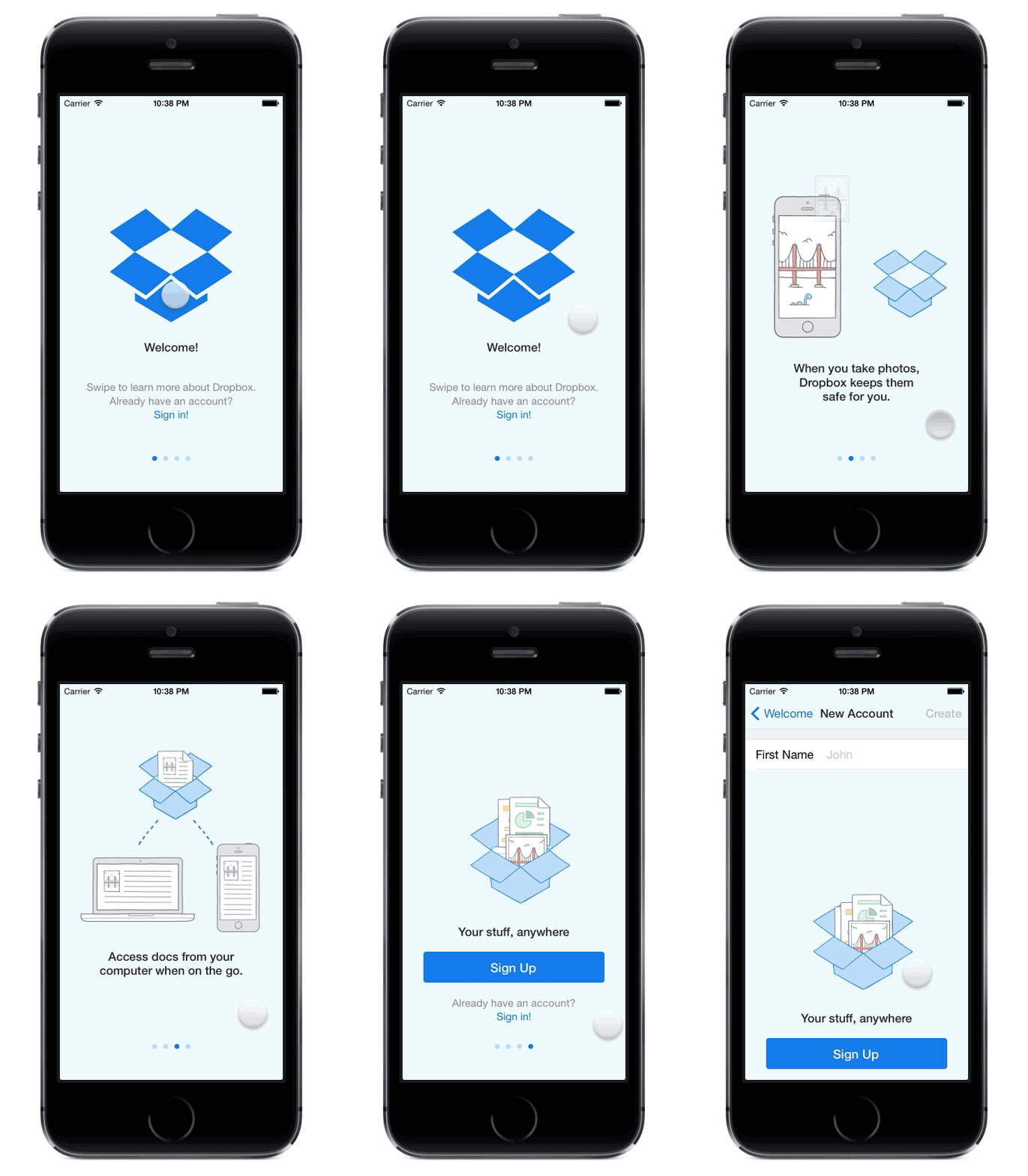
We experimented with putting the intro flow before and after login. Even though it takes longer to get to the initial account creation stage, the percentage of users who logged in or created an account and the engagement of those users was higher with the tour before login. In this case, giving the users more information is better than getting them to log in as quickly as possible.
We then designed a step-by-step flow that activated users by guiding them through a two-way sync. After completing the flow, users will have synced files from their phone to their desktop and back from the desktop to the phone. By backing up photos, files go from their phone to their computer. By installing the desktop client and adding a file from their computer, users can now see their files on their phone too. The two-way sync gives users a much deeper understanding of how Dropbox works.
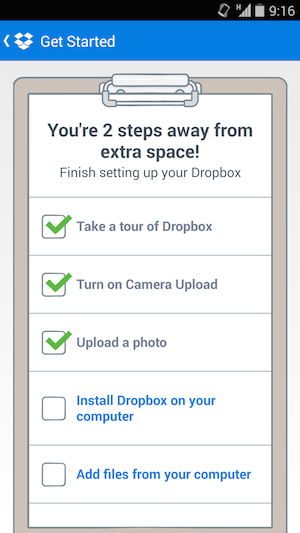
Importantly, each step in the checklist is clickable and guides users to complete the task. For instance, clicking on “upload a photo” will do something different based on the user’s state. If the user doesn’t have Camera Upload on, it will show a dialog that allows them to turn on camera upload. If Camera Upload is on but their wifi is off, it will take them to their wifi settings. By carefully guiding the user through each of these steps, we made sure nobody would quit out of frustration or confusion.
At the “Install Dropbox on your computer” step, we ran into a roadblock with our goal of carefully guiding users through each step. It’s hard to hold a user’s hand when they venture into the world of their desktop. There are a lot of potential places where they could get lost. They could fail to find the download link, they could wander off while our ~40MB installer (it includes the Python runtime) is downloading and never return, they could open Dropbox but then forget their password, etc. We eventually came up with a flow that takes users from the mobile app to the signed-in desktop app with very little risk of attrition.
Using a personalized QR code, the desktop connect flow allows users to securely log in to the website without typing in credentials and initiates an installer download. The “meta-installer” downloads almost instantly because of its small file size. When launched, it sets up permissions for Dropbox and then starts downloading the full installer and completes installation automatically.
When Dropbox is fully installed, the server, the browser, and the desktop client work together to validate the client and allow it to safely log the user in without requiring the user to enter their email and password again.
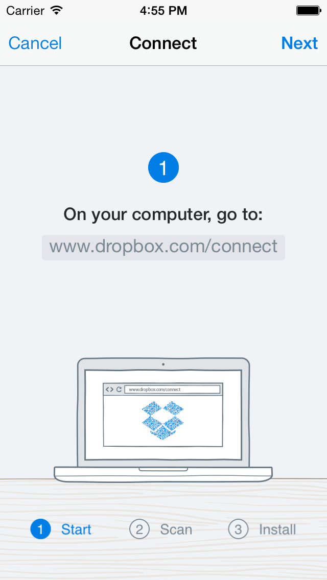
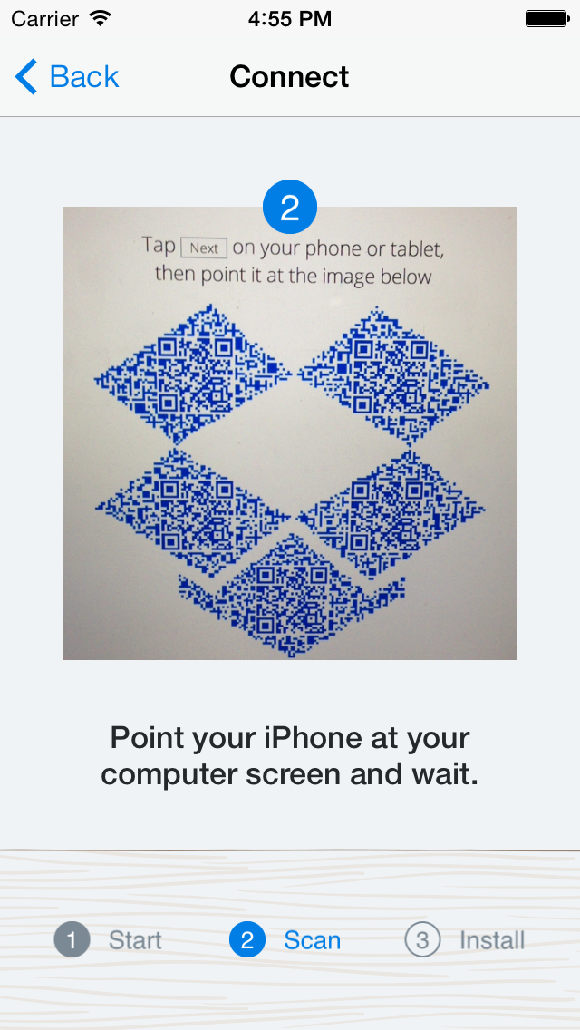
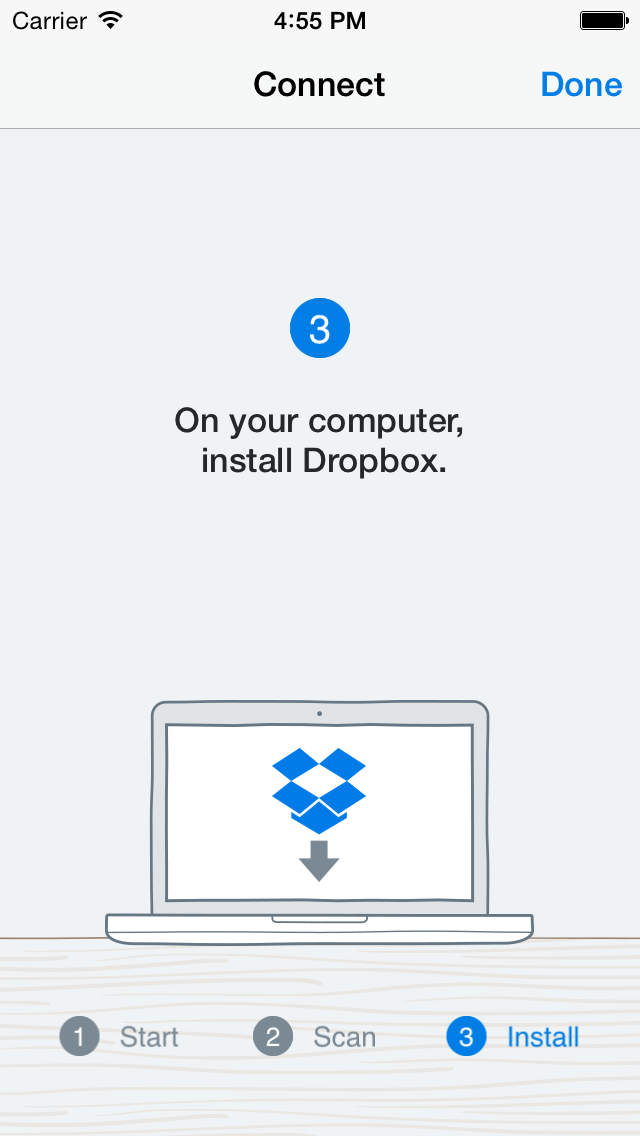
By the end of this flow, the user has a fully functioning, logged in, and ready-to-use desktop version of Dropbox up and running, and they never had to enter in their email address and password. This eliminates the possibility of a user mistakenly using a different email address or forgetting their password.
The onboarding flow described above goes a long way in helping new users set up Dropbox on their computers, but there are some more interesting challenges left to solve that would help more users get started. For instance, it would be great to help users get the most important documents and photos from their computer into Dropbox automatically. Our experiments showed that users are much less likely to complete the last step of the Get Started flow: adding files to their Dropbox. If we help users more with this step, we could likely increase that number.
The introductory flow and the desktop connect flow are both shipped on Android and iOS. The Get Started flow is still in its experimentation phase on Android. We think we have solved some fun design, product, and engineering challenges in making simple user experiences, but there’s still a lot left to do. If you're into engineering delightful experiences for users, we're hiring!

