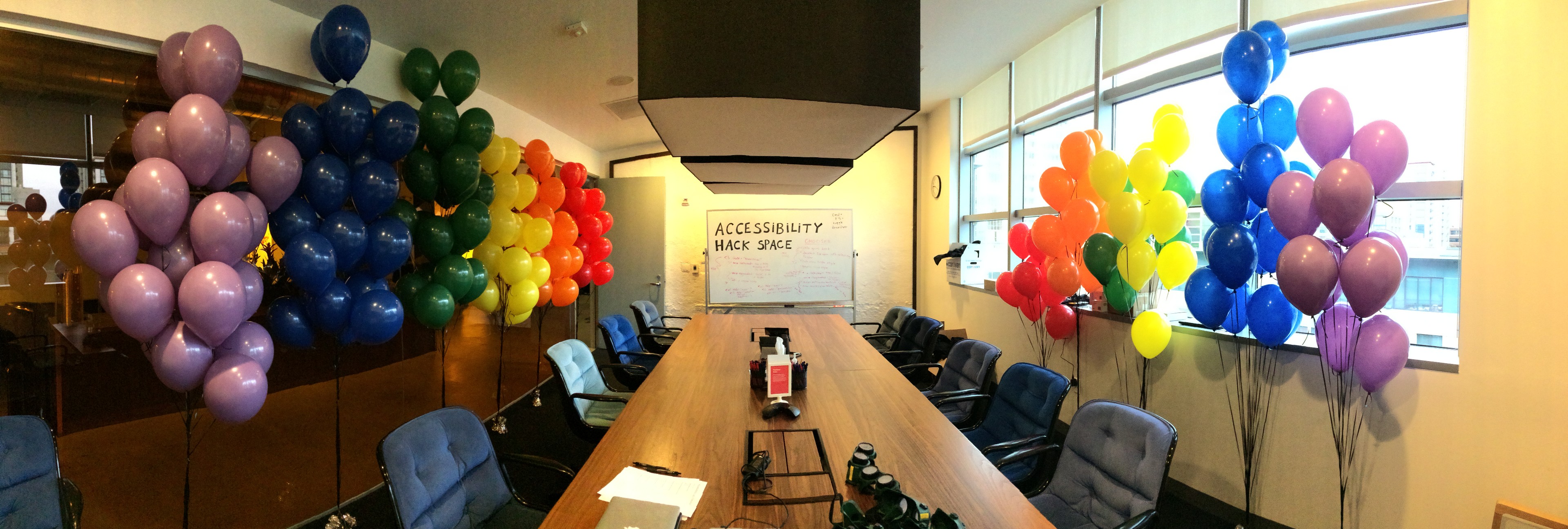
At Dropbox, we strive to make products that are easy for everyone to use. As part of that mission, we’ve been improving product accessibility for users with disabilities, and building a collaborative culture in which our engineers understand and value accessibility best practices as part of their process.
To create accessible products, you need to find opportunities to spread accessibility knowledge and enthusiasm in a sustainable way throughout your company. But awareness is one of the largest barriers to implementing these best practices into a product. Most computer science curriculums at colleges and universities don’t include in-depth coverage of accessibility (though organizations like Teach Access are working on changing that!). As a result, technology creators don’t always know much about accessibility unless it’s already had a direct impact on their life.
There’s a lot of great information out there about how to make accessible products. The W3C’s Web Content Accessibility Guidelines (WCAG 2.0) and the BBC’s Mobile Accessibility Guidelines are both examples of great resources for understanding usability considerations, and how to implement them effectively. I’d like to share some techniques we’ve used within our engineering organization (and beyond), to keep accessibility top-of-mind for product creators.
Building a robust accessibility program at Dropbox is an ongoing process, but I’m excited about how far these initiatives have spread over the years. I hope these tips can help you prioritize accessibility in your organization, too!
Generate excitement
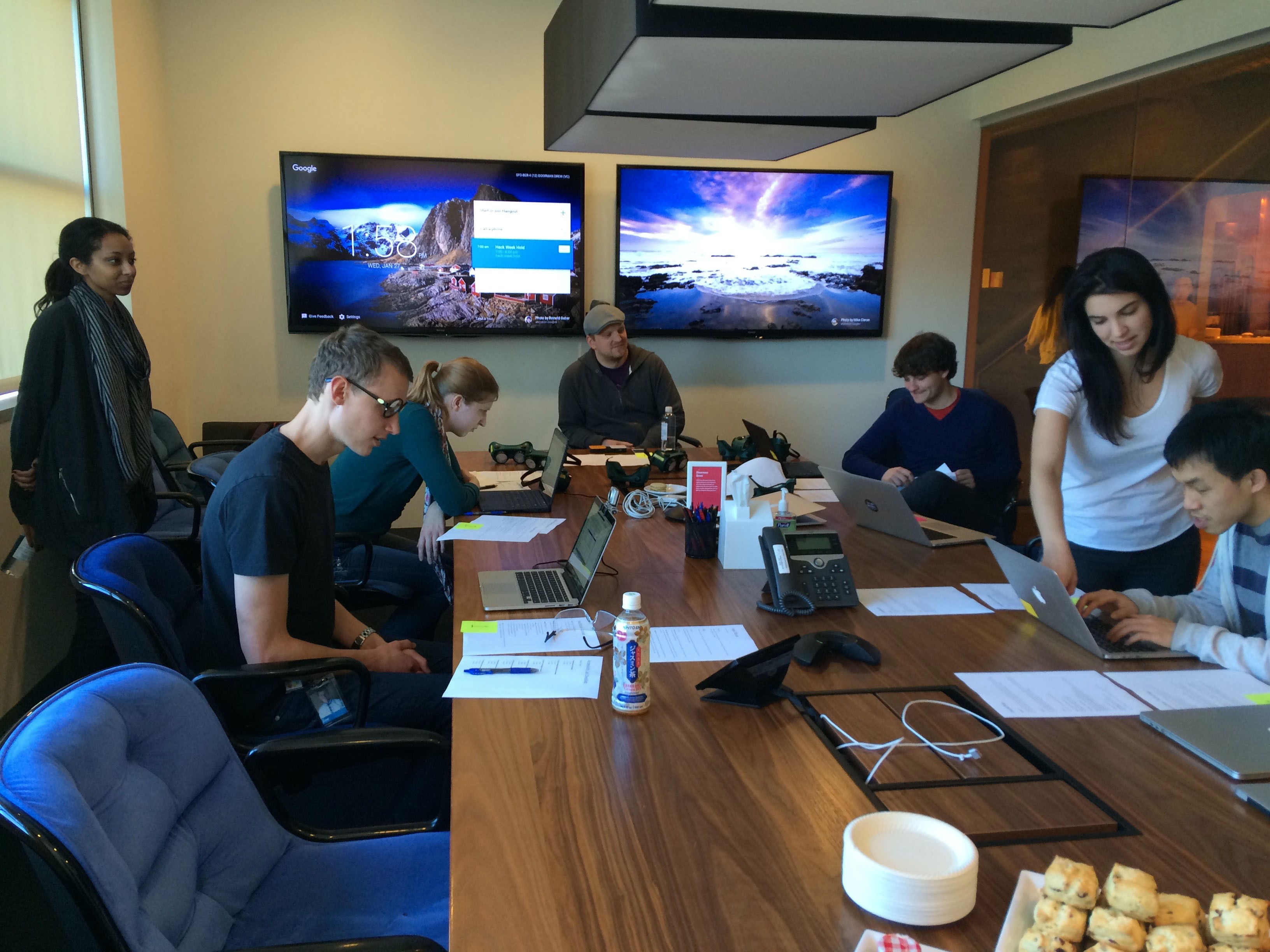
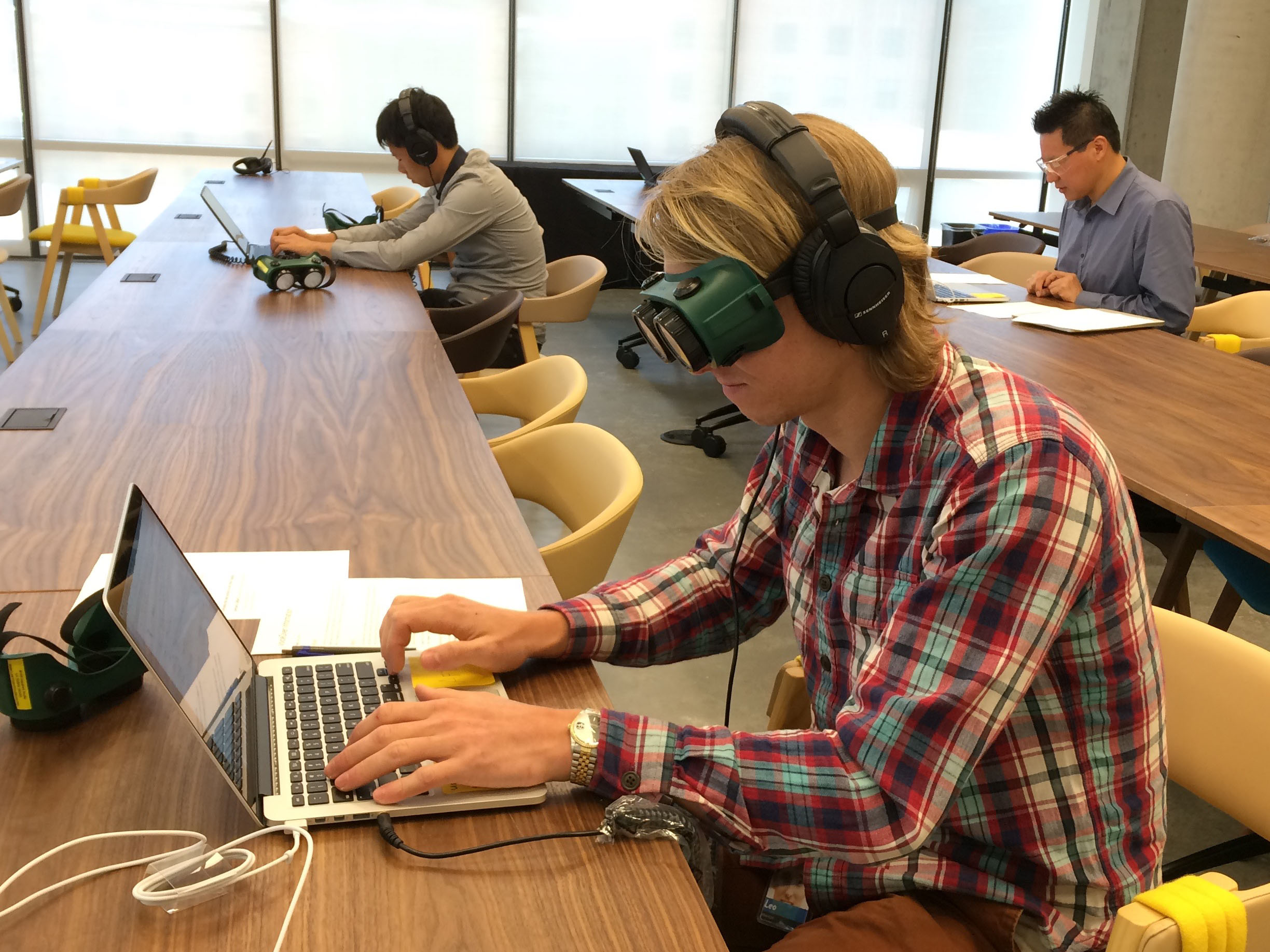
Run an Assistive Technology Lab Assistive technology, also referred to as access technology (AT), is anything that helps a person with an impairment complete a task more quickly, easily, or independently. In the digital space, assistive technology such as screen readers, speech recognition software, screen magnifiers, and switches help users navigate and interact with UIs. As you might imagine, the user experience of a product can change a lot depending on what type of assistive technology you’re using with it.
We wanted to expose our product teams to the wide variety of ways that our users might navigate our products. In 2016, our Accessibility Working Group started running Assistive Technology Labs to give teams hands-on (or, in the case of speech recognition software and head mice, hands-off!) experience exploring their own features with these tools.
Our pop-up labs have several stations, each with a particular type of assistive technology. At each station, we present Dropboxers with three tasks: an easy task to familiarize them with the basic mechanics of the station’s AT; a slightly more involved task; and an extremely challenging (if not impossible) task meant to highlight areas where our user experience could be improved. We want Dropboxers to get frustrated by the last task, so they can better understand our users’ pain points and channel that frustration into fixes. Many of the tasks from our first Assistive Technology Lab are no longer challenging, thanks to continuous UI improvements from our design and engineering teams.
If you’re interested in running your own Assistive Technology Lab, here are a few tips:
- Remember that the goal of these labs is to learn about various technology that people use with your product, not to simulate the personal experiences of individuals whose abilities may be different from your own.
- If a participant has a frustrating time using an AT, it can be hard to tell if that’s due to their unfamiliarity with the AT or because the experience is broken and difficult for even that AT’s most adept users. Make sure the folks running the labs have enough context to help guide participants when they get stuck, and remind participants that a more thorough understanding of these tools comes with practice and discussion with people who use them on a regular basis.
- Consider avoiding speech recognition software in the lab setting. I had to train the dictation software on my own voice while setting up our first lab, and soon found that it had trouble recognizing instructions from colleagues whose voices were rather different from my own, especially in a room with several people talking. Screen readers, switch controls, head mice, various color modes, and zoom tools work much better in a lab. Set these up with multiple operating systems and devices.
Reward your organization’s accessibility champions
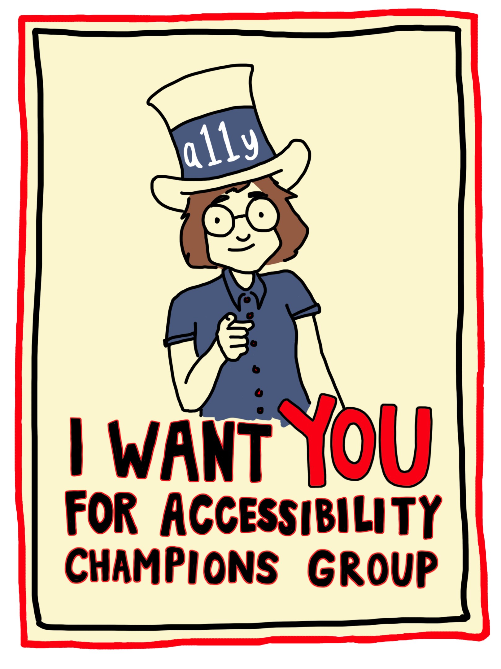
We expect everyone on Dropbox’s engineering, product, and design teams to include accessibility in their process, but we like to recognize folks who put in extra effort to improve our internal accessibility processes or make our product experience more inclusive. One way we do this is through our badge system. Anyone can nominate a colleague (or themselves) for an “Accessibility Advocate” badge which, when awarded, appears on their profile in our employee directory:

Spread knowledge
When I joined Dropbox as its first full-time accessibility engineer, I wrote a ton of documentation, thinking it’d be a great way to get everyone around me to become accessibility experts. But I quickly realized that reading long documents wasn’t the most engaging way to start learning accessibility best practices, especially when those documents lived outside of engineers’ normal workflows. Now, in addition to this documentation, we’ve been spreading accessibility knowledge in more dynamic ways:
Incorporate accessibility feedback into the development process To give accessibility advice relevant to colleagues’ current context, we built an accessibility debug tool and added it to the footer of our website, visible only to Dropboxers. The debug tool runs a series of accessibility checks on the current page.
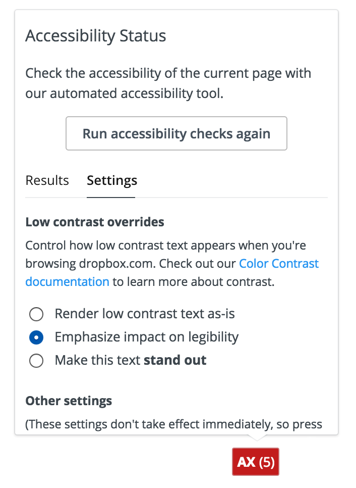
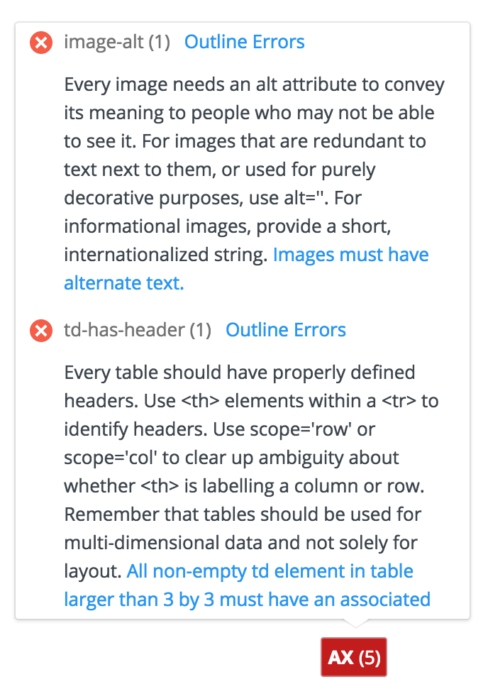
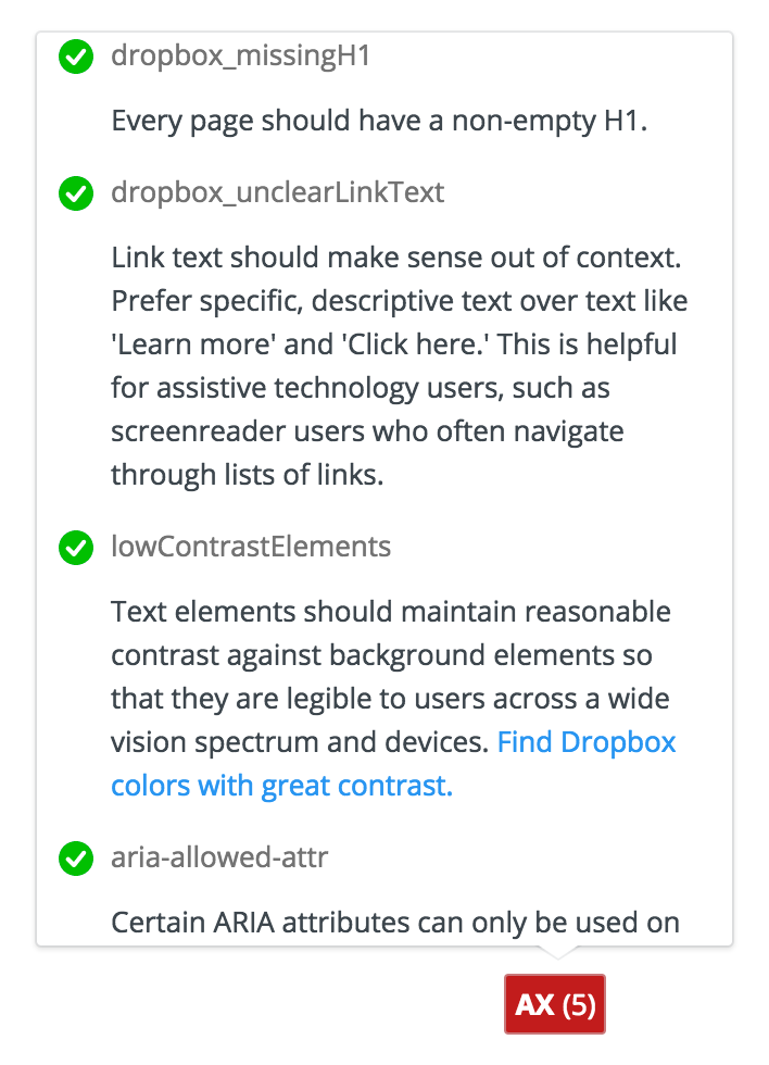

For this tool’s first iteration, we included a small set of custom accessibility checks, looking for buttons and links without accessible names, keyboard-inaccessible links, unlabelled input fields, images without alternative text, and low contrast text. Since then, we’ve expanded the tool to include 51 accessibility checks, most of which come from Deque’s open-source aXe framework.
What’s great about this tool is that it provides practical, relevant accessibility feedback without being too overwhelming or intrusive. As front-end developers work on new UIs, they can consult the tool to see if they are introducing any new errors on the page, get tips on how to fix them, and find contact information for the Accessibility Team if they still have questions.
Automated accessibility checks like this can be incorporated into several stages of the engineering process, from on-page tools to code linters and unit tests.
Do accessibility bug bashes Does your team ever get into a room together to test out user flows and try to break the product? At Dropbox we call these “bug bashes,” meetings during intermediate stages in UI development when engineers, quality engineers, designers, and product managers gather together to manually test a feature in a variety of scenarios and find as many bugs as we can. Bug bashes are the perfect opportunity to check for accessibility issues in in-progress features. During a team bug bash, get a few people in the room to try each core flow with just their keyboard, or with a free screen reader or their computer’s built-in zoom controls. Can they perform all expected tasks? Do they ever get stuck or lost?
While you can schedule accessibility-specific bug bashes for thorough exploration of a product’s accessibility issues, it’s important to weave accessibility bug exploration into the regular bug bash meetings. This reinforces that accessibility is integral to usability, not a separate issue to address.
Make an entire feature accessible All of a company’s products should be as accessible as possible. If that isn’t the case with your current suite of products, it can sometimes be hard to figure out where to start. One of the best ways to get going is to just pick one feature and commit to making it accessible. The best candidates for this project are brand new features you can build from the beginning with accessibility in mind, or a pre-existing, high-traffic area of your product. The team working on this feature will learn by doing, developing accessibility knowledge that will carry over to their next projects and set an example for other product teams.
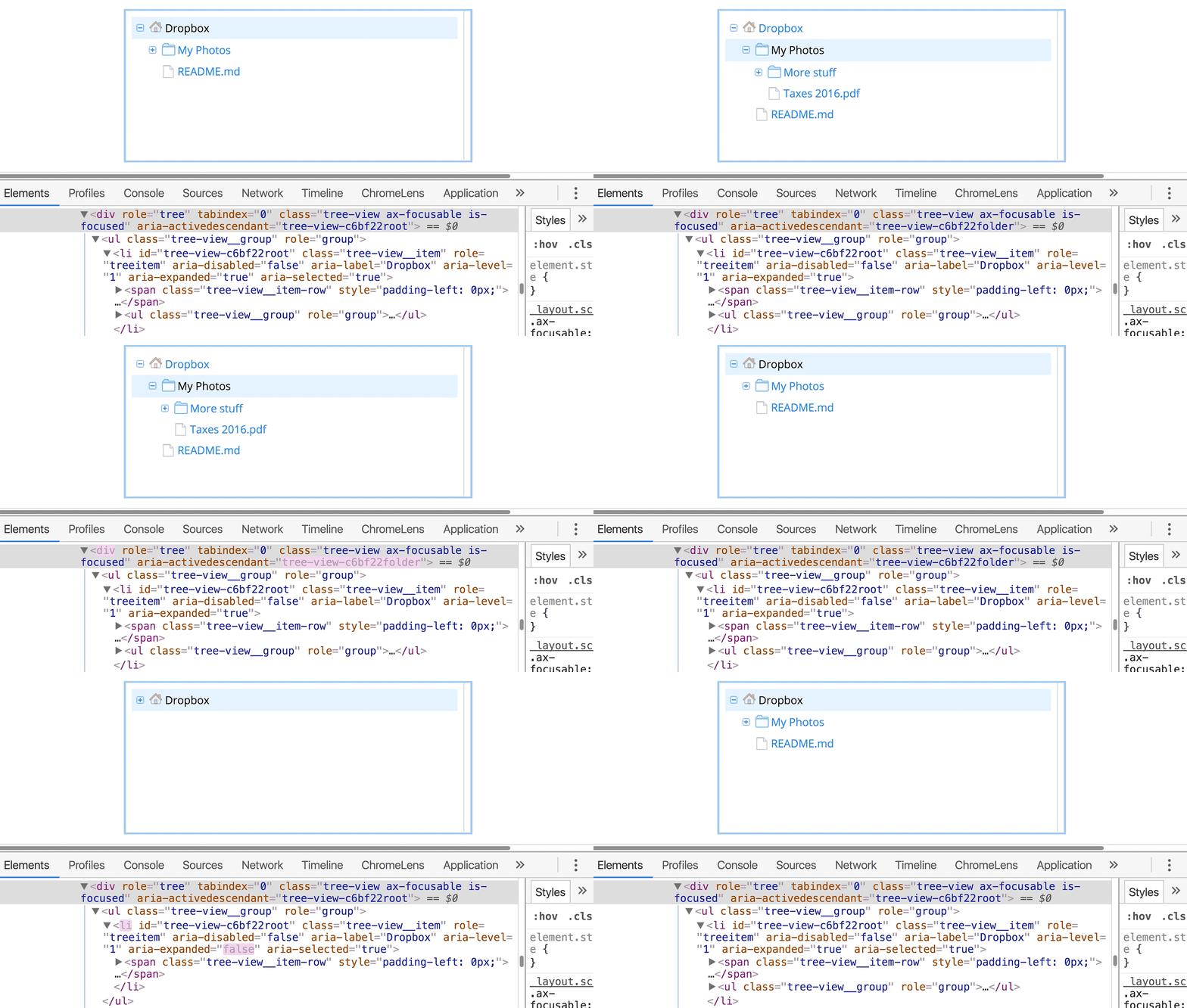
Accessibility improvements to a single feature can also help make other features more accessible with minimum effort. For example, during a recent refresh of our file browsing web UI, we paid special attention to the screen reader and keyboard experience. This led us to build a number of new React components that had accessibility baked into them, including dropdown menus and tree views. Because we architect our React components to be reusable, these accessibility enhancements have since trickled into other areas of our web UI.
Here’s an animation of our reusable tree component in action:
Host internal talks and invite guest speakers Tech talks are a great way to share accessibility knowledge throughout your team. Try to do one once a quarter to keep the information fresh, especially if you’re consistently hiring more UI engineers and designers. Looking for ideas? We’ve recently covered these topics in our internal talks:
- Accessibility improvements to Feature X, and what we learned along the way
- Automated test frameworks for accessibility
- Tips for writing with accessibility in mind
- Tips for manually testing for accessibility
- Screenreader 101
If you’re interested in seeing a blog post from us on one of these topics, let us know in the comments. Bring in guest speakers to talk about inclusive design concepts! Invite accessibility experts from other companies to talk about their processes and frameworks. Invite speakers with disabilities, who can speak from personal experience to the importance of accessible technology. External speakers tend to draw a good crowd and definitely bring new and engaging perspectives. Record these talks so colleagues can reference video archives later.
Keep learning
Conduct user research Accessibility is about users. While you can follow all the accessibility guidelines out there and make UIs that pass every automated accessibility check, they may not actually be very efficient or enjoyable for your users. It’s important to listen to your users and turn their feedback into product improvements.
Usability tests with screen reader users helped us find areas where we could improve the keyboard flow of dropbox.com. In another focus group, Dropbox users with low vision shared stories illustrating the impact color contrast has on how efficiently they can manage their files. With this user insight, we’re able to craft richer, higher quality experiences for all users.
**If your organization is already doing research studies for new products, include people with disabilities as participants. It can also be helpful to lead focus groups to better understand a particular user group’s needs. Make sure to compensate research participants for their time. Invite product engineers to these sessions, or share video recordings with them, so they can understand the impact their code has — for better or worse! — on real users.
Get involved in the community The digital accessibility community is a tremendous group of folks who are all driven to make technology better for people with disabilities. Staying connected to this community is a great way to keep up on current best practices, exchange advice on tricky accessibility design and development problems, and share ideas about how to advance technology further. I’ve found that this community is super generous about sharing what we’ve learned, as we all really want to provide users with quality, consistent patterns for navigation and communication.
One way to get involved is through attending meet-ups and conferences. Most major cities have an accessibility interest group you can join. In San Francisco, for instance, Dropboxers attend Bay Area Accessibility Camp and some Bay Area Accessibility & Inclusive Design meetups. There are also major accessibility conferences around the country and the world, including the recent CSUN Assistive Technology Conference. These events are a great way to learn from industry leaders in accessibility. You can also get involved online by joining the Web Accessibility Slack community or following the #a11y hashtag on Twitter.
Wrapping up
We’ve found some of the best ways to get people engaged in accessibility are by hosting events that highlight usability impact, providing lightweight tools that point out easy-to-fix bugs, and celebrating the work of successful projects. There are still many more ways to weave accessibility into your team’s process. Try out some of these techniques for Global Accessibility Awareness Day (Thursday, May 18th) and see what sticks!
Stay tuned to our blog for more accessibility tips from our team. And if you want to help make Dropbox more accessible for our 500 million users, we’re hiring.

